Self scan checkout
Redefining how customers checkout in-store
My role
Lead UX Designer
UX Design, UI Design, Research, User-Testing, Analysis, stakeholder management, Design system
Highlights
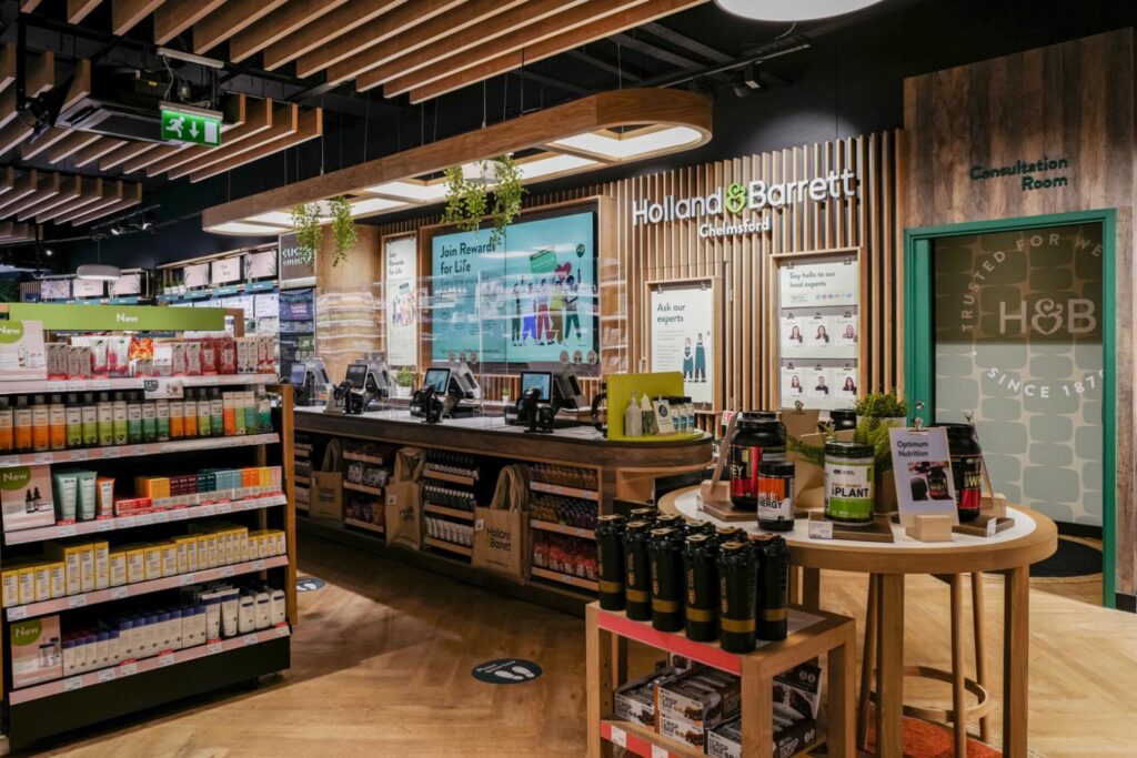
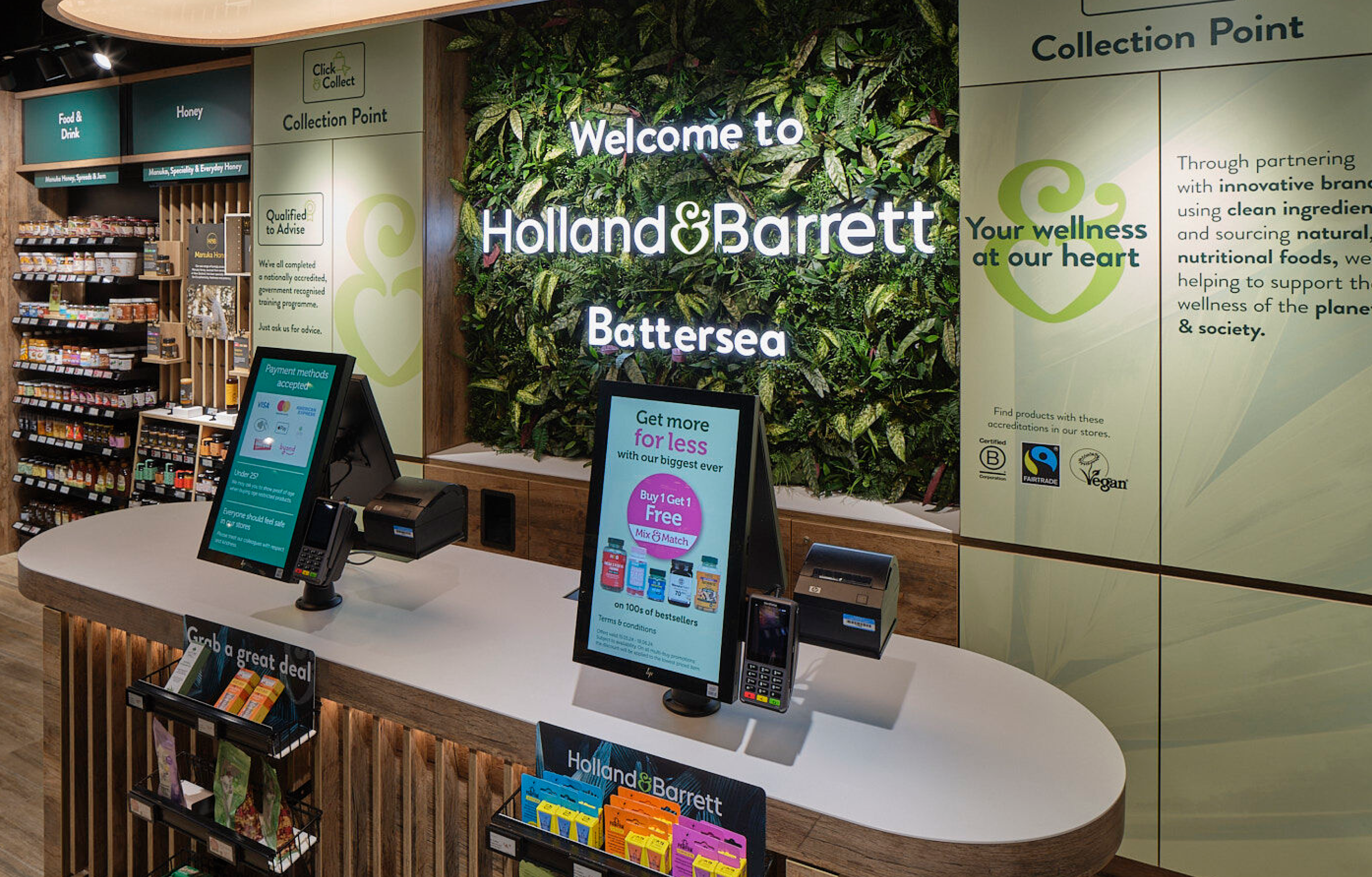
The new checkout tills are now live in H&B stores across the UK and Europe. And have replaced more than 1,800 pay points across nearly 800 stores.
Backstory
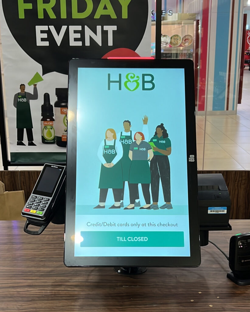
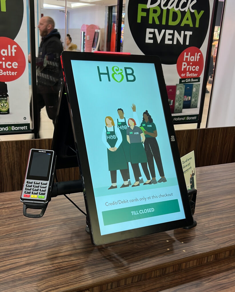
I worked as a UX Lead for designing a self scan checkout experience for Holland and Barrett. Accomodating for both B2B and B2C user needs in this project. The self scan checkout is now live in select H&B stores, with the intention to go nation wide and international shortly.
Customers expect an in-store checkout experience to be as efficient and seamless as competitors and e-com experiences. Store staff also don’t always have enough time to man the till, with all their other tasks.
The goals
1.
Introduce a new checkout experience for customers on the go
Integrate a new checkout experience for both customers and store colleagues (B2B & B2C).
2.
Target new customers.
Appeal to a younger demographic of H&B customers, shopping on the go.
3.
Streamline store colleagues time.
Allow store colleagues to efficiently complete other tasks, while customers checkout independently.
4.
Accessible experience.
Create an experience that all customers are able to use. Ensuring it’s wheelchair accessible.
The competition and understanding design patterns
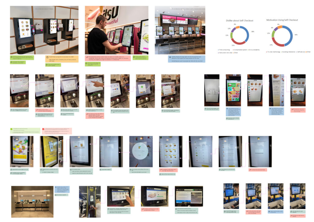
A self scan checkout has become a familiar digital experience for many, over the last few years. We conducted an in-depth competitor analysis to understand what customers have grown to expect with a self checkout. We conducted a feature analysis to establish our competitors successes and shortcomings. Alongside evaluating how a customer interacted with the self checkouts, to better understand the best placement for features within our own service.
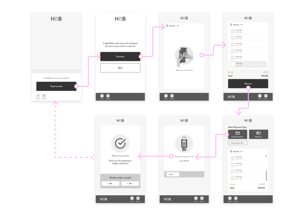
Wireframing
We began to ideate solutions for how we could create an efficient and frictionless checkout experience for our users. The main demographic of self scan users being 20-30 where shopping in a time effective manner with minimal human contact was preferred. However, a considerable portion of H&B customers are of age 50+, which meant making sure our designs appealed to both audiences.
Design Considerations
There was also the consideration for how disabled customers would interact with our checkout, especially wheelchair users. This became an important problem to resolve, one many retailers struggle to accommodate for. As a result, we moved all features and interactions to the bottom third of the checkout screen, ensuring we could accommodate as many of our customers as possible.
Iterations and Development
After initial testing, we started to understand the importance of the customers’ physical experience. Although we received positive feedback, we noticed frustrations revolving around the inconsistency between the real world and digital experience. We identified this as a lack of an overall omnichannel design system.
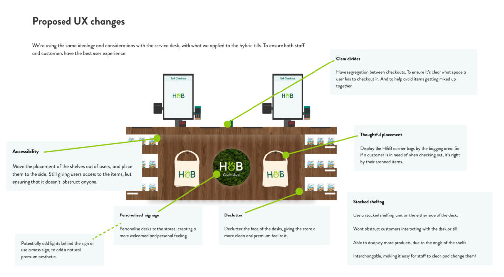
After understanding that having an optimised digital self checkout wasn’t enough to ensure a seamless and user-friendly experience. We worked in collaboration with the service desk design team, providing the research and proposing how we could improve our customers’ experience.
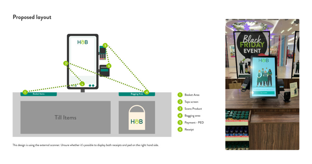
Exploring the most effective layout for the checkout desk, ensuring ease of use for the customer. Designing an experience using unidirectional movement to optimise flow, so each step felt instinctive. Alongside clean physical signage that clarified how the customer should be interacting with the checkout. Other physical considerations were providing carrier bags in convenient locations, based on the optimised flow and relocating any shelving to ensure accessibility for disabled users.
Testing & Validating
As this was such a new concept to the H&B stores, we conducted a thorough amount of user testing to ensure our designs were validated by customers.
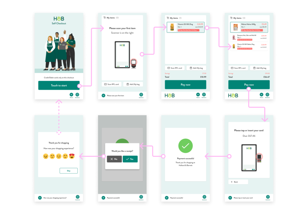
After observing customers interacting with the till, the most frequent frustration were customers unsure how to begin their checkout journey. As it was not clear where and how they could scan their products. This problem was caused by both the hardware and the UI of the checkout.
To solve this we tested multiple iterations of designs to provide clearer instructions for the customer. The most successful design was an animation, as it also solved the problem for customers who may not be able to speak or read english.
Next steps
We plan to continue to test the new design of the self checkout with our customers and colleagues. Ensuring that the combination of the physical and digital design work harmoniously together allowing for a great user experience for any customer. Alongside refreshing the display areas for upselling products to integrate with our newly designed checkout and not impede our accessibility improvements.

