Case study
Cerebro
Empowering store colleagues to expertly advise on products and provide information to customers, based on their conditions and goals.

Empowering store colleagues to expertly advise on products and provide information to customers, based on their conditions and goals.
Empowering store colleagues to expertly advise on products and provide information to customers, based on their conditions and goals.
During the coronavirus pandemic, as Holland and Barrett was an essential retailer, it was one of the few stores allowed to remain open. Due to Covid restrictions, Holland and Barrett had to adapt how they served their customers. In 2020, H&B partnered with a company called Mercaux, who helped provide a third party app for tablet use, which was trialled in a select few stores.
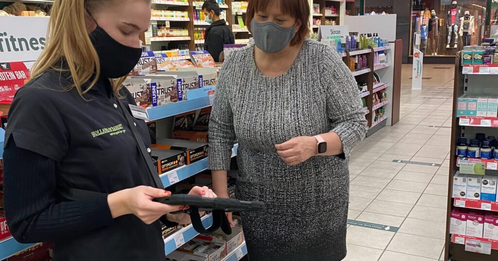
Mercaux was an experiment that allowed store colleagues to create baskets and pay for them via the tablet. This allowed store colleagues to serve customers outdoors and put many health conscious customers at ease, as they’d be able to browse and pay for their product outdoors, while still receiving the colleagues’ professional advice.
After a 6 month trial period, H&B did not extend their contract. However, Mercaux had opened our eyes to the potential of bringing a digital customer experience to our stores, similar technology could help empower store colleagues with professional knowledge, as well as boosting store sales.

We were briefed to design an in-house tablet app that would replace Mercaux, aimed at empowering store colleagues with professional guidance and knowledge. They specifically wanted an intuitive interface that was accessible for all colleagues to use, no matter their level of technical expertise.
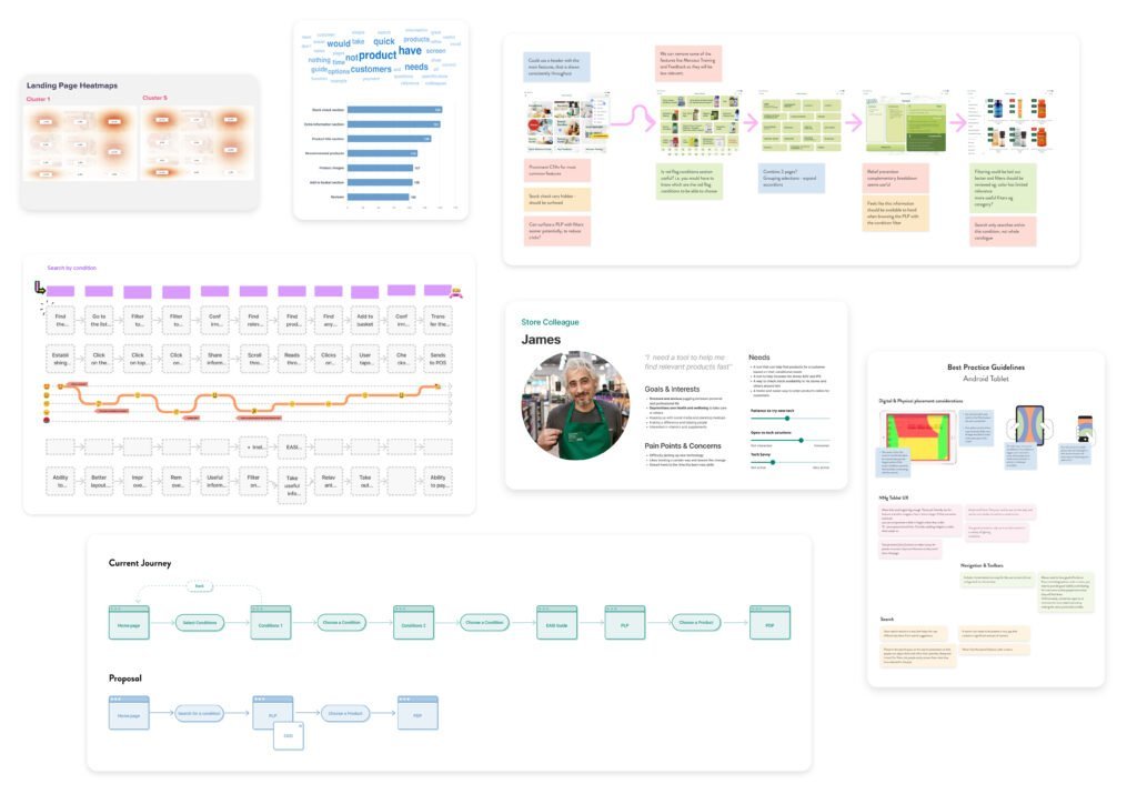
We began the project by firstly understanding how Mercaux worked and whether the new H&B in-house app could take any inspiration from its features and journeys. Analysing their data, we identified which were their most utilised features within the app. We also mapped out all the interface screens, which helped us understand how the app worked, map the key journeys, and distinguish areas we could streamline.
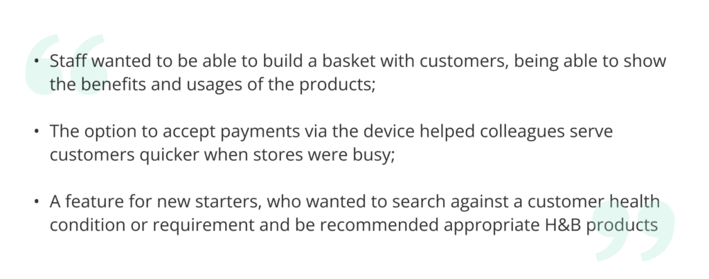
After understanding the business requirements, we began to interview store colleagues to understand the user needs and use cases for it. We wanted to understand how both customers and store colleagues currently interact in-store, to understand how and where an app could help. Speaking to store colleagues helped us determine what journeys and features to prioritise for the first iteration: a minimal viable product (MVP). Some of the key themes from our store colleague interviews:
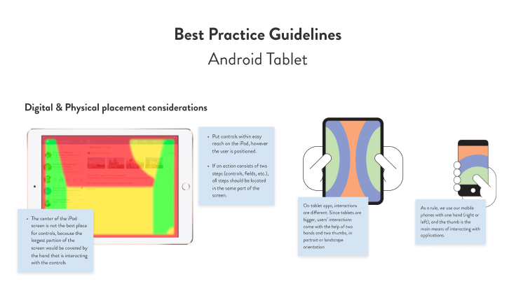
A native app’s usage and design can differ quite a bit to a website. As a result, we conducted an in-depth competitor analysis to assess their strengths and weaknesses, to identify users’ expectations and frustrations when using an app daily on a tablet.
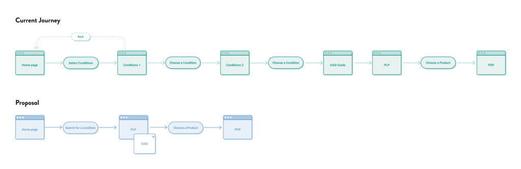
We began to ideate solutions for how we could create an app. We started by establishing the primary journeys, and mapping these out into a user flow, to help us understand and visualise how each journey would intertwine with another.
When designing the low fidelity wireframes, we ensured that we were designing towards the primary journeys, ensuring they were streamlined and as easy to navigate as possible. We wanted to make sure that the app was accessible to any user no matter their tech literacy, which is why we focussed on refining these key journeys and avoided adding any unnecessary features which may distract and overwhelm users.
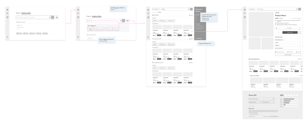
As the main use case for the app would be to search for products, we decided to increase the prominence of this feature in the home page. Making it the primary action for users as it was the starting point for most journeys and one of the most utilised features within the app.
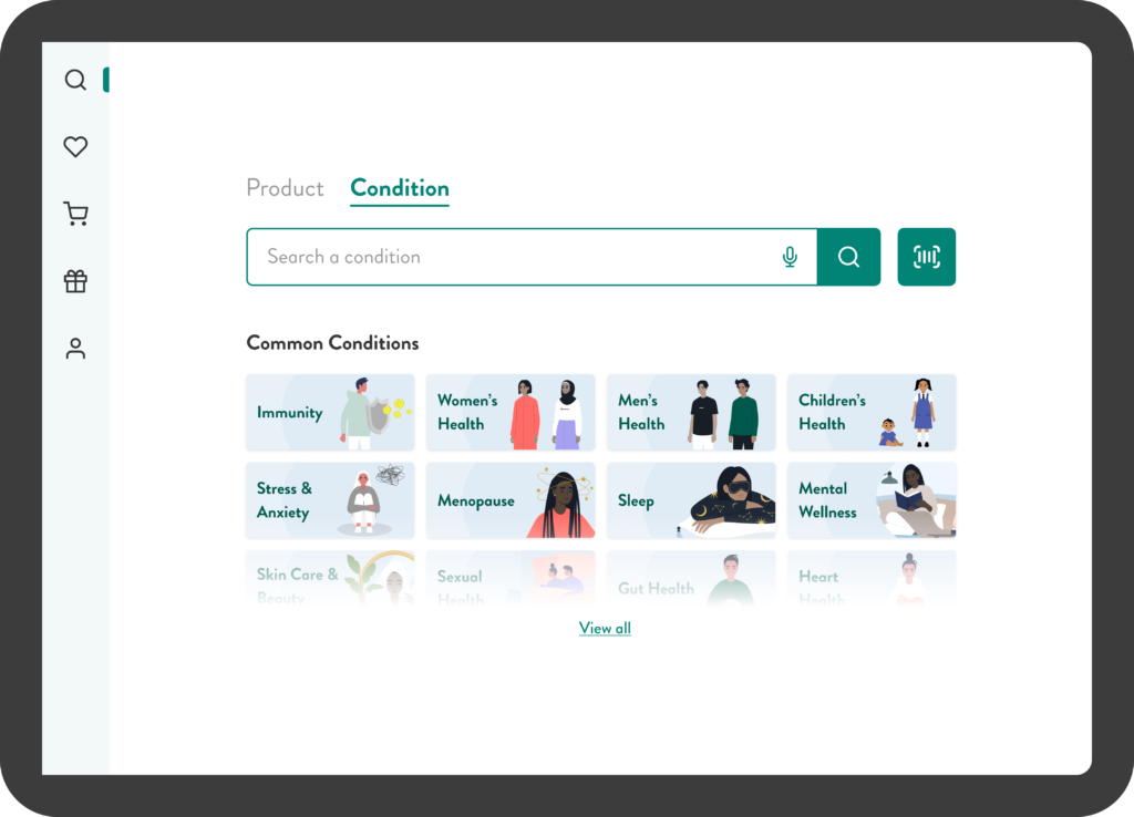
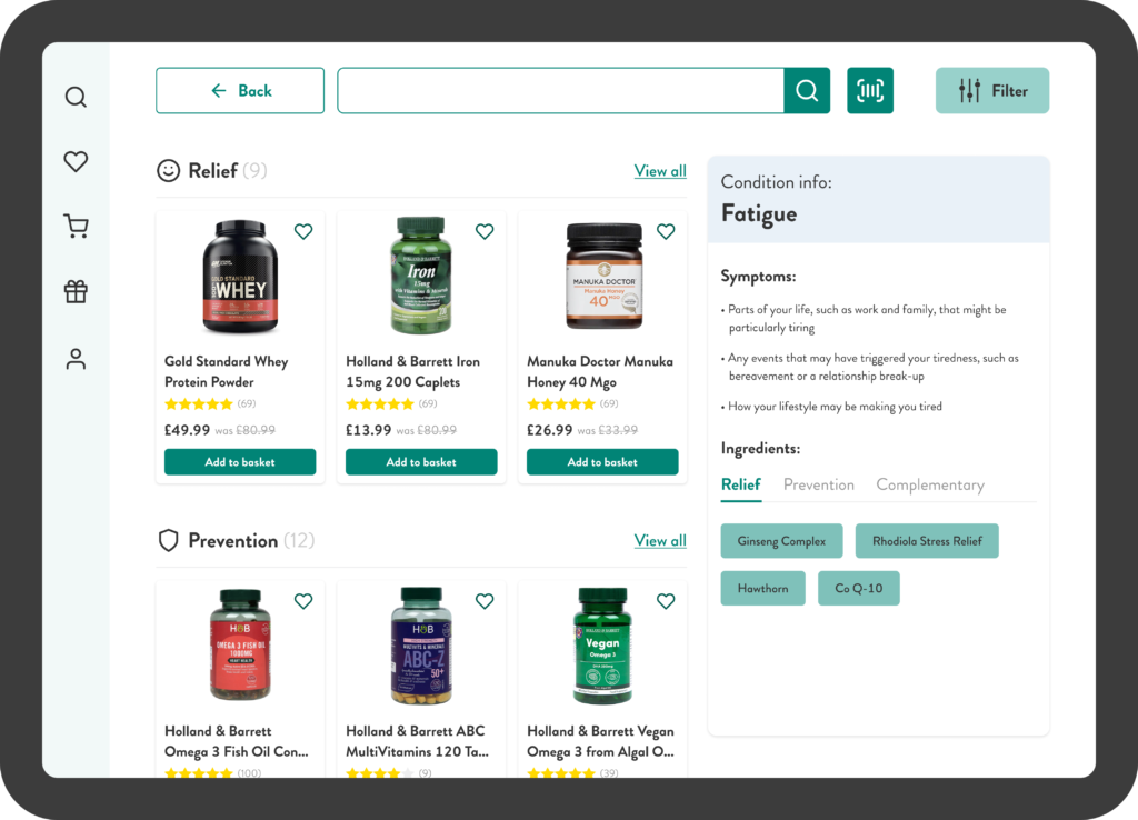
Another key use case was the ability to search for a condition. Considering many users using this app may not have in-depth knowledge on health conditions. We thought it key to display a result page for a condition, with all the relevant information for any colleague to serve a customer with confidence.
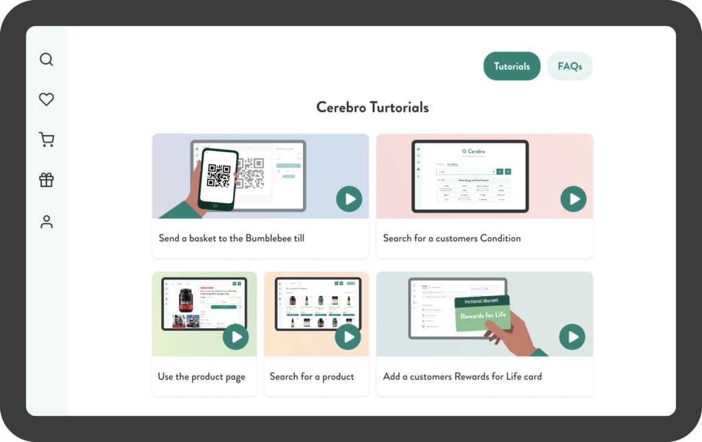
After initial testing, we understood that store colleagues were unaware of all the features that the app had to offer and how they’d benefit them. To combat this, I designed a series of in-house tutorials, with the aim to educate and inform users on all the features.
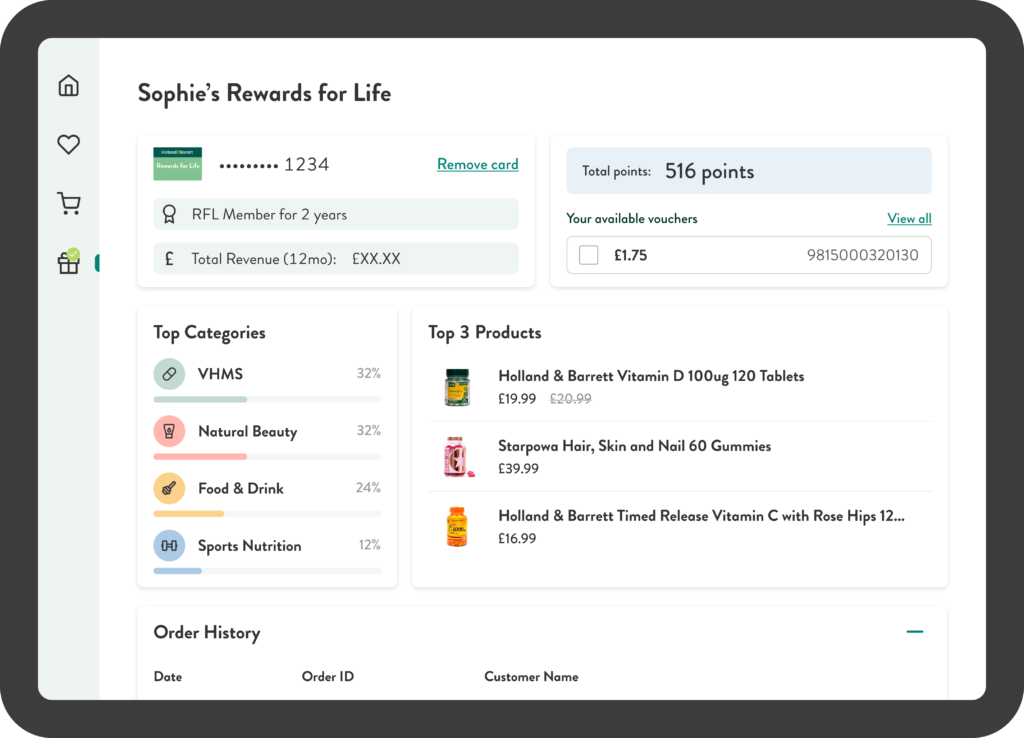
Although the tablet was helping colleagues build baskets with the customer, it was solely based on information that the customer had given. We sought to change this by allowing the tablet to view a portion of the customer’s preferences via the company’s loyalty data. This would display an overview of the customer’s shopping habits in a dashboard, helping the store colleague provide more personalised products based on their shopping habits.
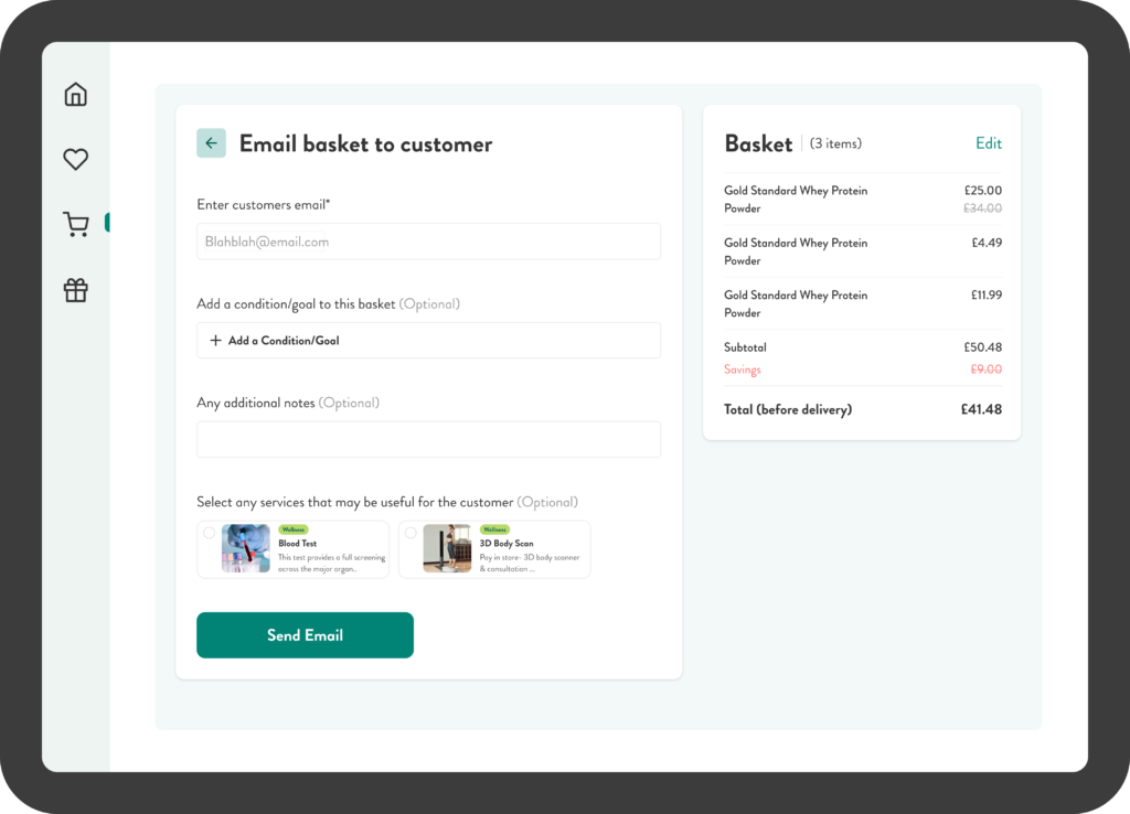
Buying products can be a commitment, and even after the store colleague has created a basket that best aids the customer’s condition, the customer may not be ready to pay, but wants the opportunity to take the information and potentially buy when convenient. Which is why I designed the email my basket feature, which would send the customer their basket of products, along with any relevant information the colleague may have mentioned, allowing the customer to order their basket wherever is most convenient, both online and in store, promoting an omnichannel experience.