Case study
Tooth+
Designing an app that helps improve your dental hygiene, for a sustainable toothbrush company.

Designing an app that helps improve your dental hygiene, for a sustainable toothbrush company.
Designing an app that helps improve your dental hygiene, for a sustainable toothbrush company.
I worked with a sustainable toothbrush company, Eco Tooth, to design a revolutionary app for their new smart toothbrush, Tooth+. The app’s aim was to learn users’ habits and daily routines, to improve their dental hygiene. We researched different users’ experiences while brushing their teeth to understand their pain points and goals, to ensure we created an app that was user-focused.
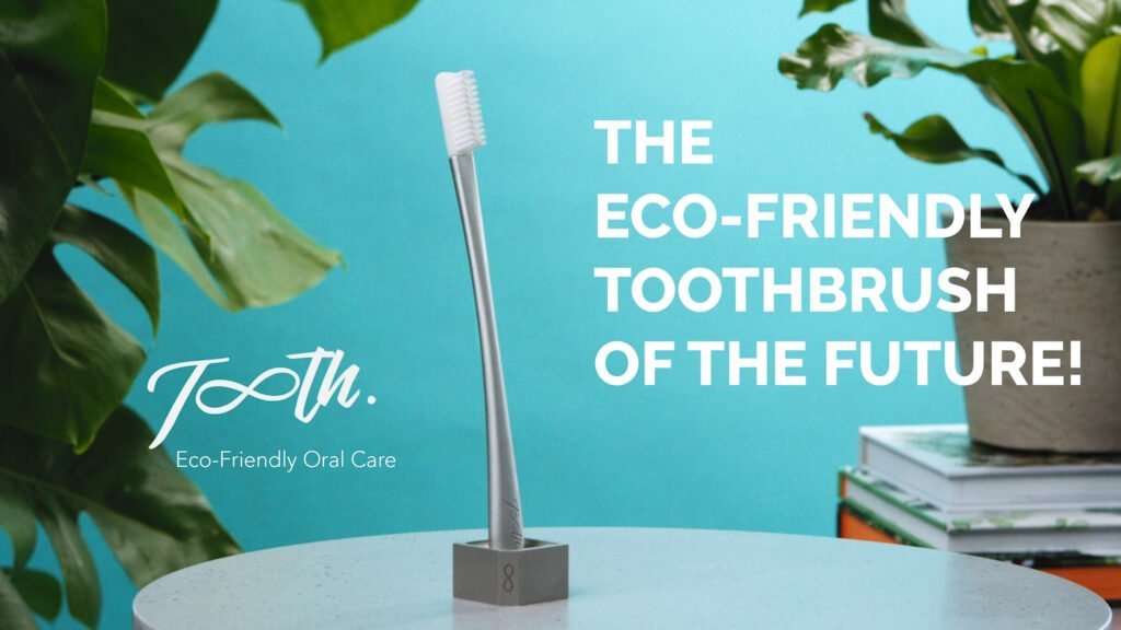
Customers associate brushing their teeth with being a monotonous task. By giving customers a personalised experience and using gamification, we aimed to reinvigorate the task for users.
To design an app that helps improve dental hygiene, by monitoring usage and educating its customers, an iOS app for the new Tooth+ Smart brush that clearly displays:
A clear, at-a-glance summary of the user’s oral health.
Including the length of time people brush for.
How effectively the user is brushing their teeth.
An AI chat option users can ask about dental hygiene issues.
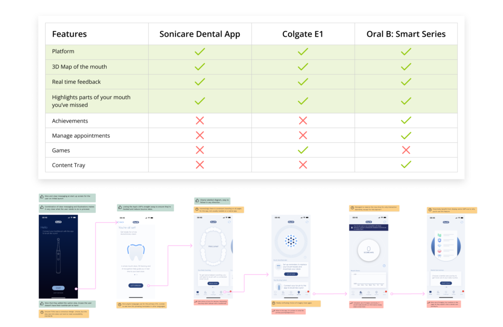
To better understand how to meet both the client and user needs, I conducted a competitor analysis, looking at brands that offered a smart toothbrush paired with their own app. The most common and popular features were categorised within a feature comparison to reveal any trends, revealing that customers who use an app-enabled smart toothbrush have grown to expect a 3D map of their mouth, real-time feedback while brushing, technique tips and feedback during brushing, and highlighting of any areas in the mouth that have been missed.
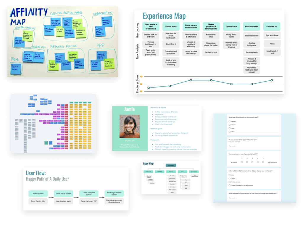
We then started a screener survey, to gather information quickly from a variety of people. Alongside conducting more in depth interviews with 15 different users, via Zoom, who fell within Eco Tooth’s target demographic. We learned the following:
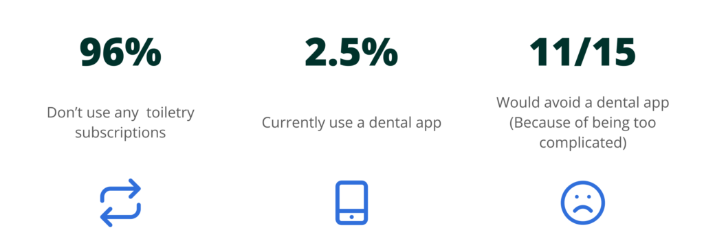
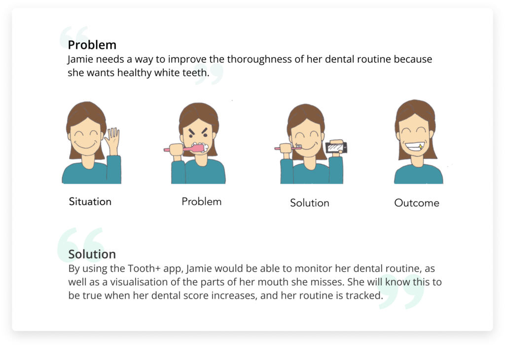
After further research through customer journey mapping and user flows, we needed to focus our findings, so we created Jamie, a persona representing Eco Tooth’s target demographic and an embodiment of our key findings. To elaborate on who Jamie is, we created an empathy map and a storyboard following her typical experience when brushing her teeth.
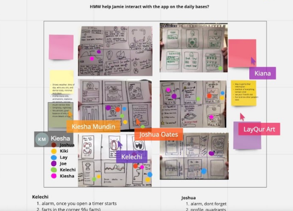
After the initial research, we began a design studio workshop with the CEO and CCO of Eco Tooth. This ensured that both sides had an agreed understanding of the most likely outcome of the app. We focussed on one problem statement, allowing all team members to quickly sketch a variety of solutions. We combined the best features and design elements to create a solution that we thought best solved our users’ needs.
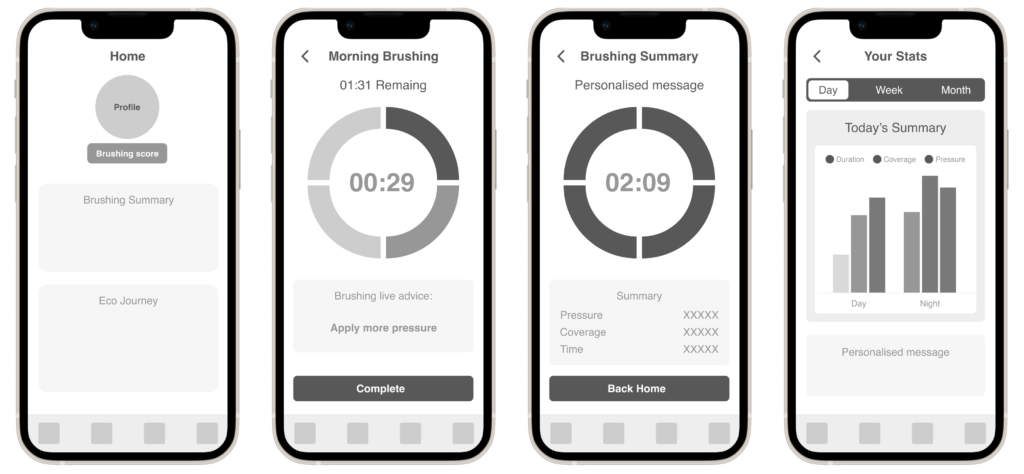
After we had an agreed idea on a solution for the primary problem statement, we began to create our low fidelity wireframes. Keeping the first iteration of the design very low fidelity, we began to test it. Testing it before we added any further detail, ensured the feedback we received was based on the core foundations of the app, e.g layout, usability, any edge cases etc.
After presenting our work and prototype to the client, they expressed how satisfied they were with how we’d managed to both meet the brief requirements and fulfil their customer needs through an engaging and intuitive product, so pleased with our work that they invited us to develop further beyond our placement.
I learned to manage a client’s enthusiastic expectations, focusing them on the product’s essential features first. I learned that prioritising and allocating tasks with clear deadlines and expectations was essential. And I learned how to acquire new software skills, to maintain momentum during the shift to remote working.