Case study
Checkout Redesign
Streamlining a checkout experience to reduce bounce rate and increase conversions.

Streamlining a checkout experience to reduce bounce rate and increase conversions.
Streamlining a checkout experience to reduce bounce rate and increase conversions.
We were tasked with re-designing the H&B website checkout journey, from the basket page through to order confirmation.
The current website took too many interactions and steps for a customer to complete an order. Decreasing the interactions and effort required would hopefully decrease the bounce rate of customers, in turn bringing in more revenue for the business.
The goal of this project was to better understand our customers’ needs and frustrations in relation to the online checkout process. To undergo this, we reviewed all customer feedback related to the checkout journey, and used a card-sorting technique to group the feedback into themes to evaluate. This approach, combined with research through Google Analytics, told us the typical quantities, payment methods and delivery methods for our customers.
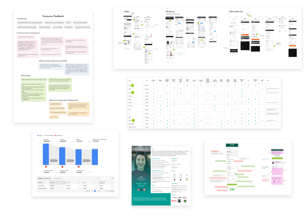
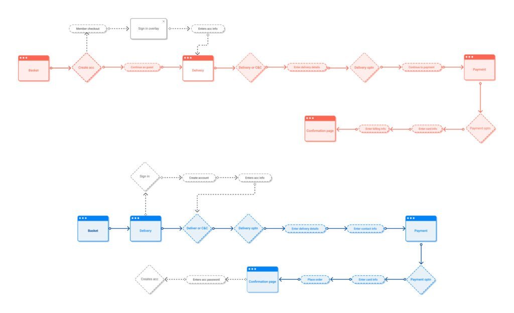
We used best-practice guidelines for online checkout design to identify our own areas for improvement, and expanded this research further by reviewing other ecommerce checkout experiences. Our primary goal for the project was streamlining the overall checkout journey, so we measured the interaction count of our competitors, an ideal metric for the length of an online journey, and analysed the shortest checkouts to understand how they created such a frictionless experience. The best examples were converted into user-flow diagrams, which clearly illustrated the differences in sequence and interactions between journeys and highlighted the most effective and creative examples.
We based three low-fidelity interactive prototypes on the best examples from our competitor analysis, and tested all three designs to understand how they performed with a variety of users. Users were given the goal of checking out as a guest, then asked how easy it was to check out, what the main reason was if they found it difficult, and whether there were any features missing that they’d expect to see in a checkout. Our test criteria was to compare user feedback and success rate to establish, in broad terms, which checkout style was most effective, and to analyse the heatmaps to see how each screen was used, informing further tests and design decisions.
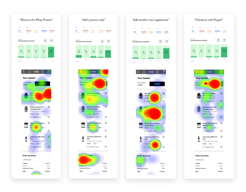
After establishing how each checkout performed. We were able to make the following initial decisions relating to the journeys, sequencing and styling. Generally speaking, we’re taking the best bits from the best checkouts.