Case study
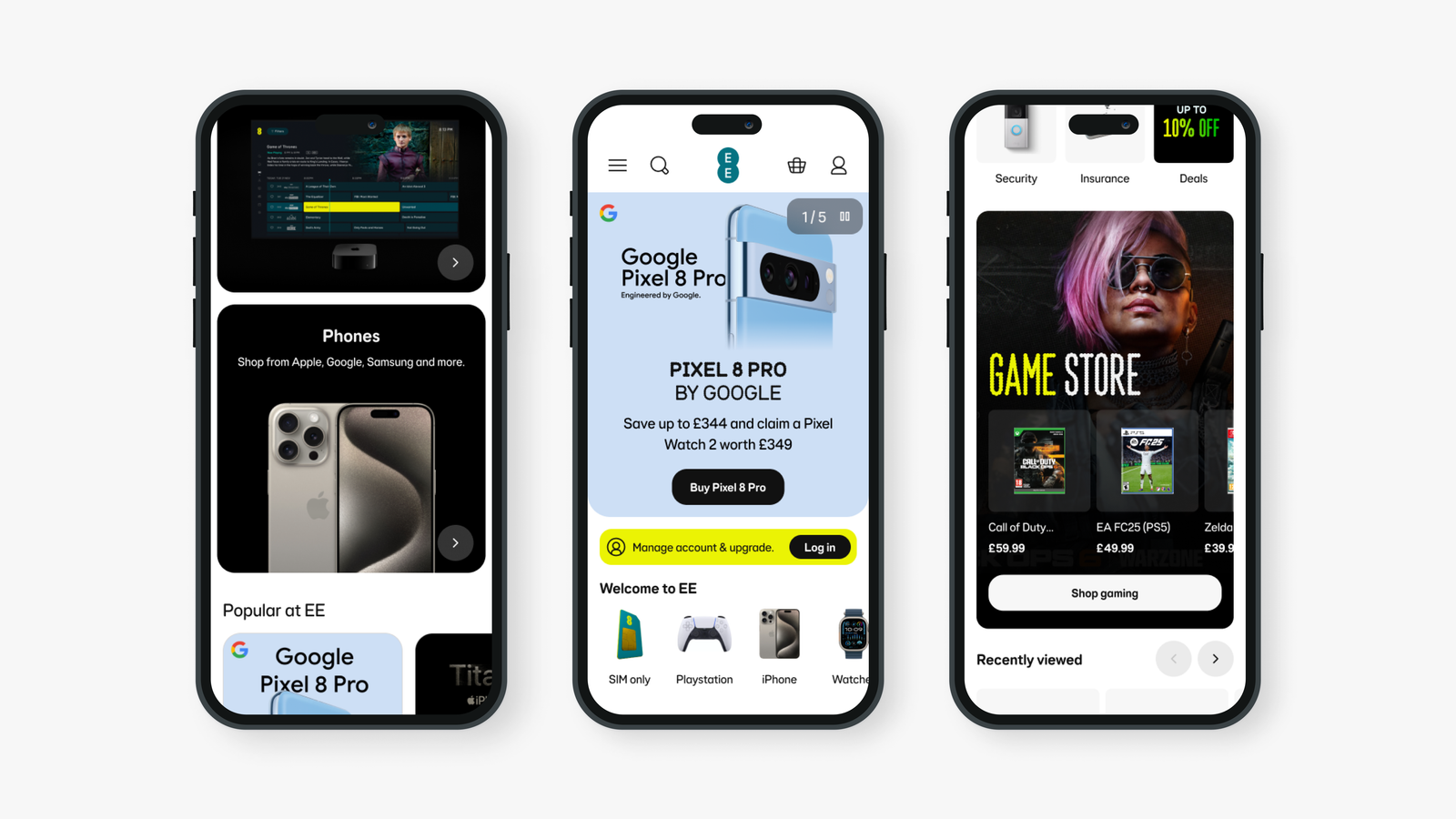
EE Homepage
Redesigning how customers shop at EE on both web and app.

Redesigning how customers shop at EE on both web and app.
Redesigning how customers shop at EE on both web and app.
As the product design lead for the optimisation squad at EE, I’m responsible for reshaping how customers explore and shop via our website and app, most notably leading the UX of our major partner launches (Apple, Samsung and Google), as well as redesigning key consumer touchpoints including the homepage and shop hubs.
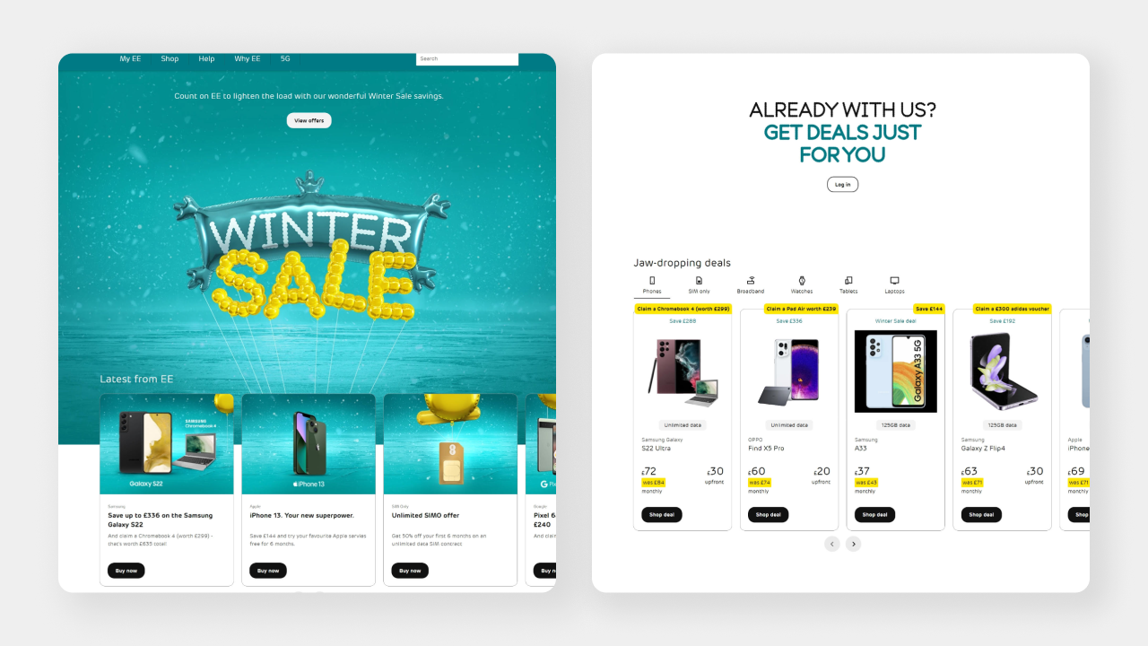
Create a reusable information architecture, prioritising consumer, partner and business needs in a cohesive way.
EE was seeing a significant drop-off rate from customers landing on the homepage, with feedback describing the page as confusing and lacking clear structure.
Direct the large volumes of customers to new and existing product categories.
The key EE shopping pages were outdated and used old components, without room to showcase EE’s broad portfolio.
The existing pages didn’t meet the accessibility requirements needed for all users to experience them.
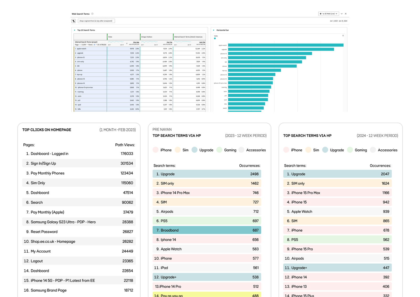
Began by analysing how customers use the existing site, utilising heat maps to better understand where and what customers want when initially entering the site. This process helped us spot underutilised areas of the page that weren’t engaging to customers.
Using analytics, we were able to visualise where customers clicked within the site. Giving us a clearer understanding of their behaviour and motivations when on the homepage.
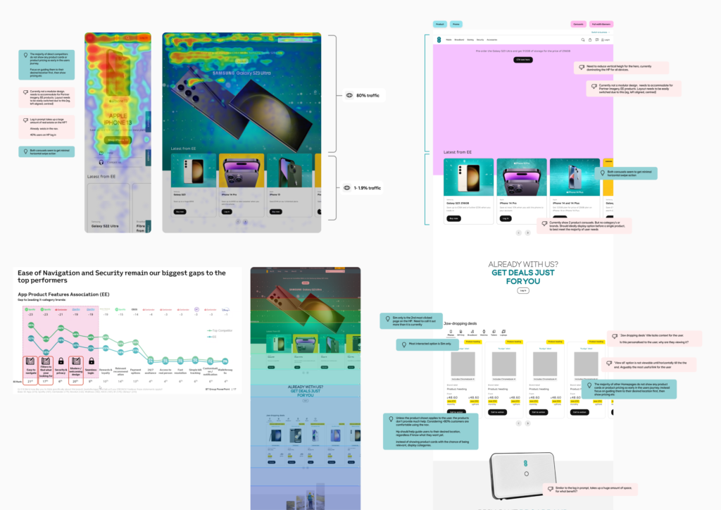
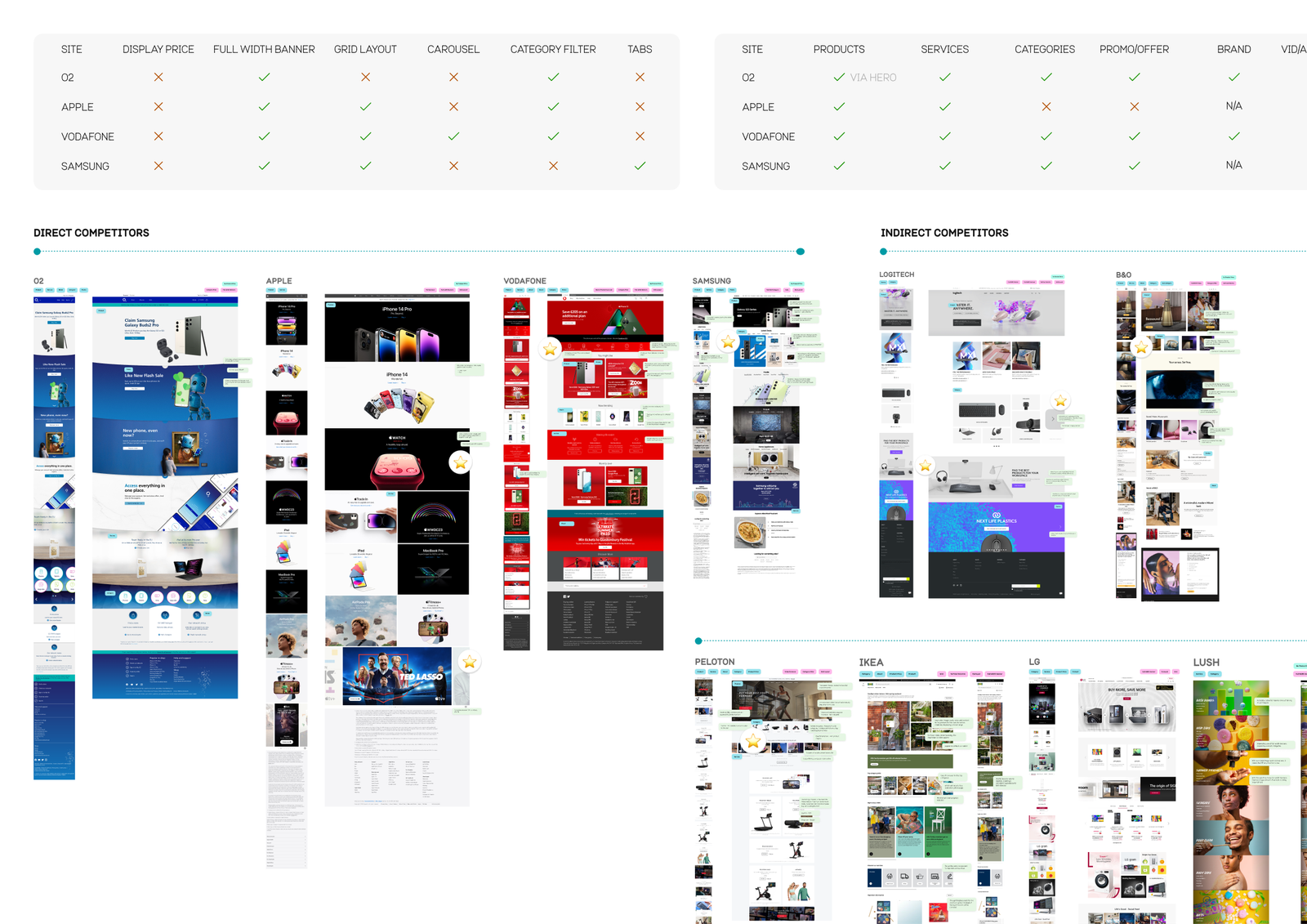
A homepage has become a familiar digital experience for many, so we ran an in-depth competitor analysis to understand what customers expect from a shop homepage, a feature analysis of competitor successes and shortcomings, alongside an evaluation of information architecture and best-practice research from Baymard.
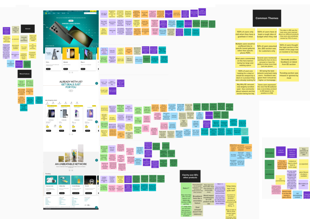
Don’t help users select a well-defined scope directly from the homepage, leading customers into broader, higher-level pages.
Use overly aggressive & distracting ads.
Don’t offer a broad enough range of product types on the homepage, so users underestimate the full range on offer.
Intrigued with why the highest engagement was with the search bar on the homepage. I analysed the top search terms to understand why a large portion of customers were interacting with it, instead of using other types of navigation.
Giving an insight into what customers want upon entering the site and what they struggle to see at first glance. Creating an opportunity to accommodate this need early on in the customers journey, eliminating unnecessary clicks and effort.
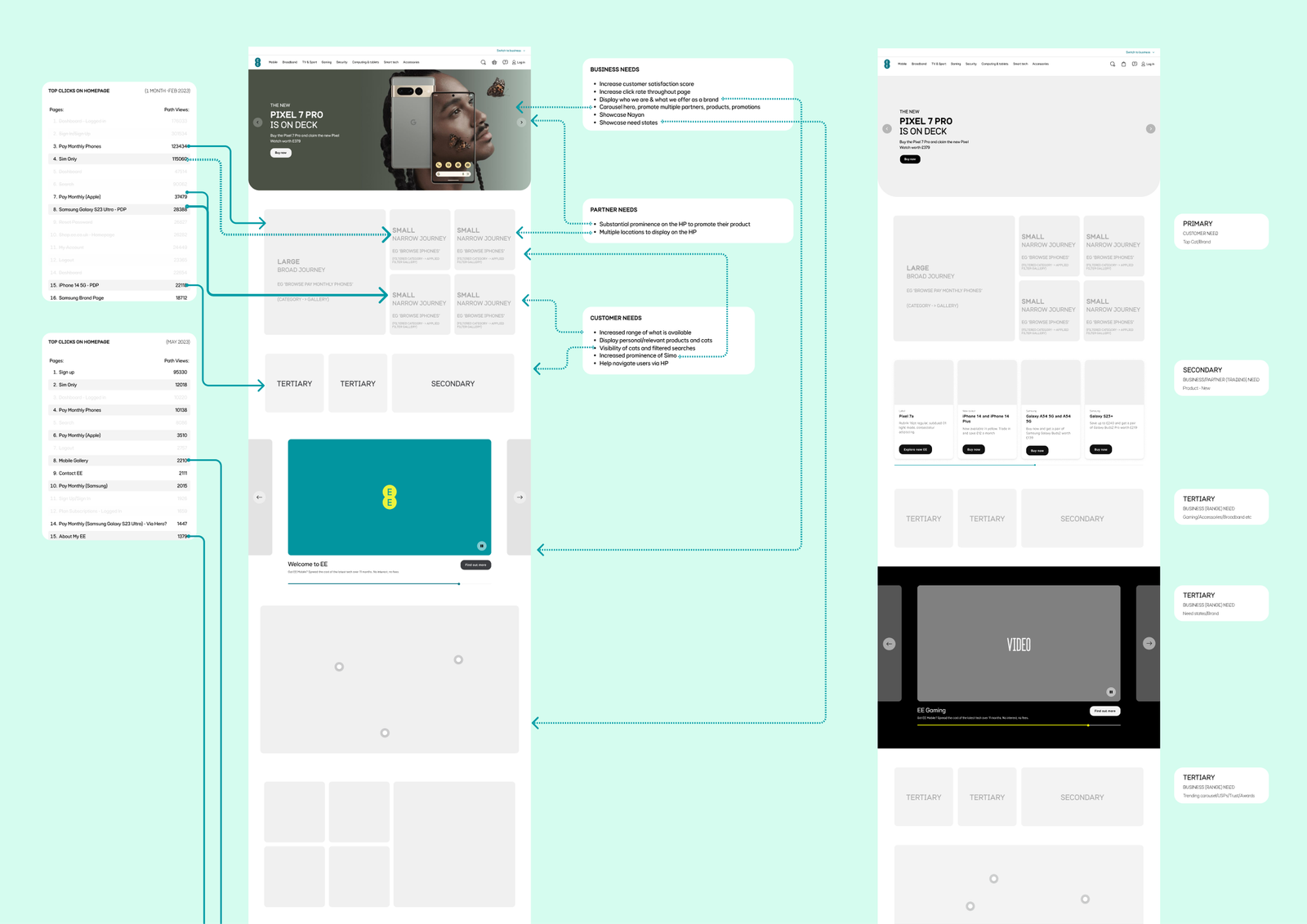
Our wireframes focused on simplified designs that introduced a new information architecture, prioritising every insight and piece of analytics we’d gathered, and ensuring each new component met at least one goal from our stakeholders.
For faster development and greater efficiency, we focused on building reusable components and templates that accommodated every edge case we knew of, letting the design flex for anything from Black Friday to an Apple iPhone launch to showcasing a brand-new category like EE Broadband, with every component fully content-editable.
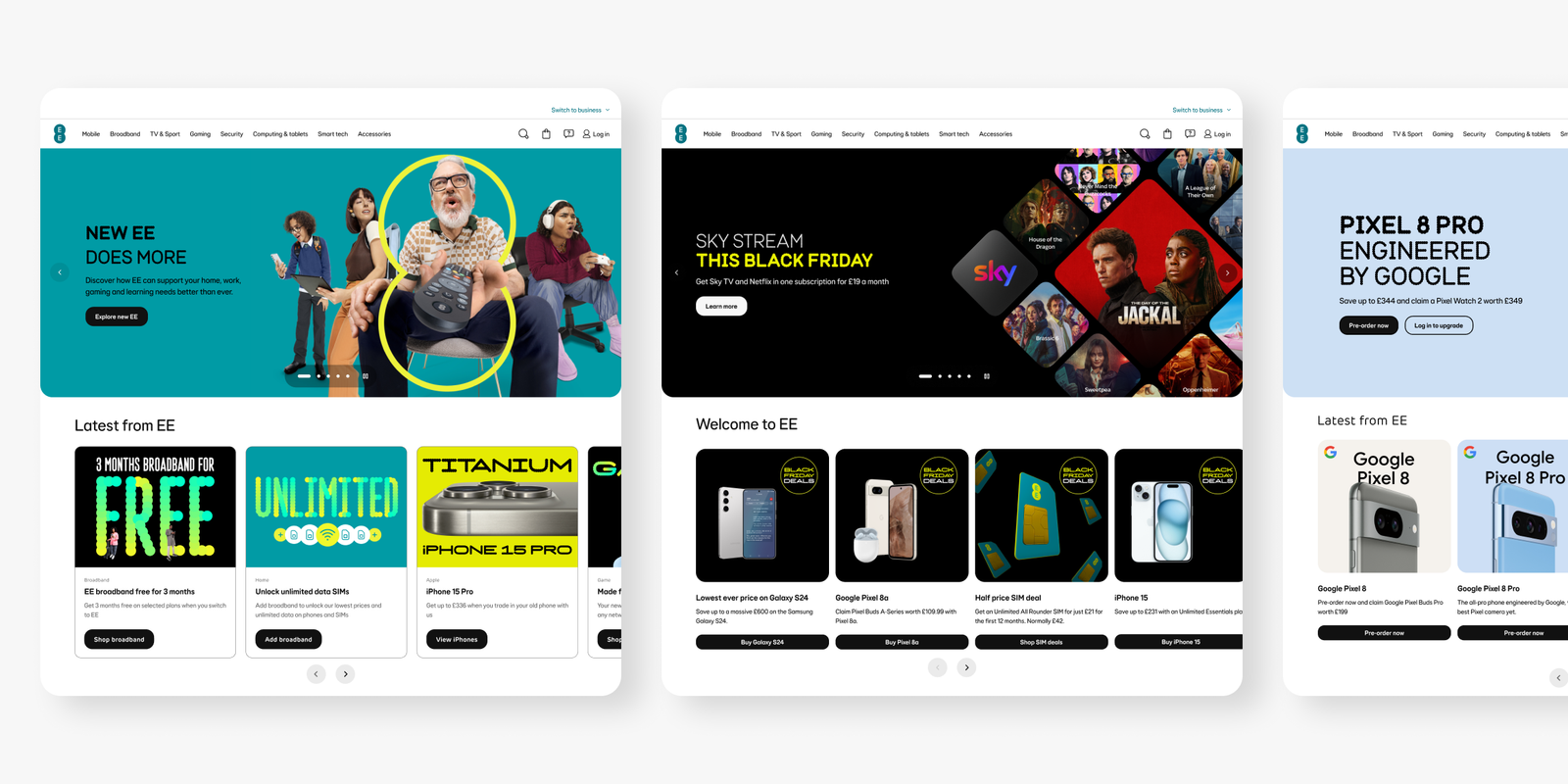
The final design balances business, partner and user needs, with overwhelmingly positive feedback from senior stakeholders, executives and partners, who welcomed the new digital real estate to showcase their latest offerings. The reusable components have reduced further development effort, allowing for far more seamless updates to the site.
New components introduced from the search-term analysis streamlined customer journeys around our top user actions. The design also passed our latest accessibility compliance checks, with screen readers now able to read the page clearly and every component and asset meeting WCAG AA.